Contrast Coloring with Unicorns
Posted by DESIGN TEAM

Hi everyone! It's MEG here today, and I've got a different kind of tutorial to share with you.
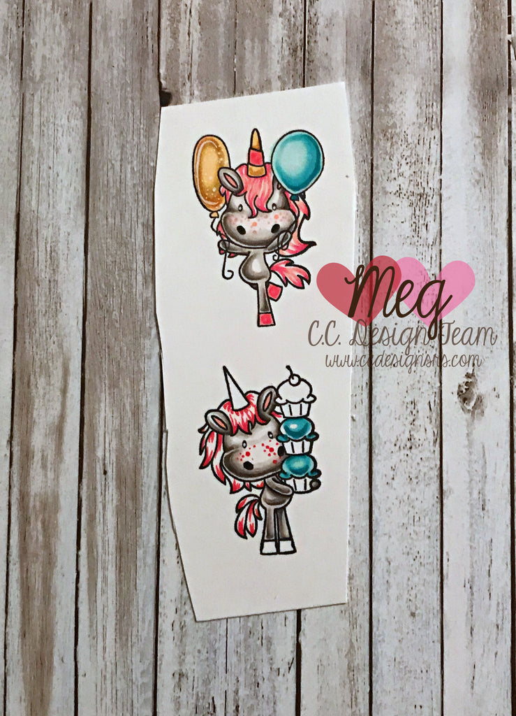
My tutorial today is on doing something I do a lot - using lots of contrast in coloring.
I've used the Party Unicorns clear stamps to illustrate.
In these images, I show you 3 different ways I use contrast in coloring.
(1) check out what I did with the unicorn bodies, balloons, and cupcakes.
I trace a line with my darkest marker just inside the artist sketched lines.
I fill in the space between the artist sketched line and the line I just drew with my lightest color.
Then, I gradually get lighter until I'm using a shade of color just above white. It's ok (good even!) if the shades you choose don't blend perfectly. For my blue balloon, I used 3 colors that are VERY different from one another.
(2) love your white space! You an also add contrast by intentionally leaving spaces white.
Check out the top unicorn body, the bottom unicorn mane and tail, and the middle cupcake.
(3) find a good white gel pen and/or use a dotting technique to add texture. I used a white gel pen on the gold balloon, and some pink markers on the unicorn cheeks to add freckles. Make sure you vary the size of your dots, whether you're using a colored marker or a white gel pen. This really makes a big difference in your finished product!
I hope these tips were helpful to you. See you next time!
TAGS:


